You're looking for other sites like Doodlebuzz:
 |
A new way to explore the news through an experimental interface that allows you to create typographic maps of current news stories.
http://www.doodlebuzz.com/
popularity:
news
visualization
typography
web2.0
search
flash
design
webdesign
inspiration
mashup
|
new
search by a custom tag signature
 |
Newsmap is an application that visually reflects the constantly changing landscape of the Google News news aggregator.
similarity:
popularity:
news
visualization
newsmap
google
web2.0
infographics
information
flash
mashup
design
|
 |
Browse, play and interact with msnbc.com's spectrum of news. This three-dimensional visualizer features a webcam color sensor, newscollector and 3D automode, with ...
similarity:
popularity:
news
flash
rss
visualization
3d
design
inspiration
web2.0
interface
newsreader
|
 |
An interactive study of modern mythology, using global news data from Daylife
similarity:
popularity:
visualization
news
design
interactive
web2.0
art
media
universe
culture
inspiration
|
 |
Silobreaker aggregates news, blogs, research, audio, video and other digital ... stories of the day with Silobreaker's contextual and graphical search results. ...
similarity:
popularity:
news
visualization
aggregator
search
web2.0
searchengine
media
tools
trends
research
|
|
|
Providing a broader (and deeper) view of Digg through a host of Flash visualization tools.
similarity:
popularity:
visualization
digg
web2.0
design
labs
flash
news
information
tools
data
|
 |
Automated interactive exploration of the words and pictures that define the time. Gleaned hourly from international news sources and presented without human ...
similarity:
popularity:
news
photography
art
visualization
flash
design
cool
images
photo
media
|
 |
No information avaiable
similarity:
popularity:
news
visualization
web2.0
tools
google
mashup
flash
nachrichten
internet
politik
|
 |
Interactive website designers based in San Francisco. ... book.stamen.com. DesignworksUSA. Schwab. Splatter. Continue reading "Everything, Everything: ...
similarity:
popularity:
design
visualization
agency
webdesign
data
interactive
flash
web
inspiration
web2.0
|
 |
An exploration of human emotion, in six movements. By Jonathan Harris and Sepandar Kamvar.
similarity:
popularity:
visualization
art
design
feelings
web2.0
blog
social
inspiration
flash
cool
|
|
|
Visual editing of headlines, stories, and newspapers. An exploration into info graphics and data visualizations using the news as a data source.
similarity:
popularity:
design
infographics
visualization
inspiration
blog
news
information
typography
webdesign
visualisation
|
Sorting Results
- This slider determines how the matched sites are sorted.
- If you want to see the most popular sites that are somewhat related to your search, slide this more towards "popularity."
- If you want to see the sites that best matched your search, regardless of popularity, slide this towards "similarity."
Must Include Tags
- Matched sites will not be shown unless they have all of the tags on this list.
- This feature is useful for when you require a site to have been tagged as something.
- To add a tag to this list, click "add tag" or click on any tag in a result.
Must Not Include Tags
- Matched sites that have any tag on this list will not be shown.
- This feature is useful for filtering out results that have tags you are absolutely not interested in.
- To add a tag to this list, click "add tag" or click on any tag in a result.
Types of Results
- This option lets you specify the types of sites to show.
- If you want to only see domains (www.
.com), select "domains only." - If you want to only see articles (www.
.com/something/here), select "articles only." - If you don't care, or care so much about both, select "Both".
About The Results
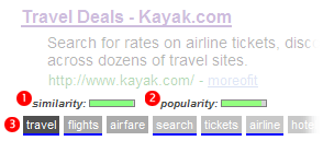
 an example search result
How moreofit Searches
Each website has a unique tag signature -- a set of words
that users have described the website as. Moreofit searches
for websites that have similar tag signatures and displays the results.
1: Similarity
A site's "similarity" is determined by how well its tag signature matches the tag
signature that is being searched for. A 100% match means that it has the exact same
tags in the exact same order, while a 0% match means it has no tags in common.
2: Popularity
The popularity of a website is, well, pretty much self explanatory.
3: Tag Signature
The tag signatures show how a site is described. The deeper the color of the tag,
the more frequently the website is tagged as this. Tags underlined blue denote a tag
that is in common with the search's tag signature.