You're looking for other sites like Diseasome:
|
|
Diseasome, explore the human disease-gene network map. Printable posters and datasets available. ... Home. Map. Poster. Book. About. Contact | Credits: Gephi ...
http://diseasome.eu/
popularity:
visualization
health
science
disease
network
data
mapping
complexity
visualisation
education
|
new
search by a custom tag signature
|
|
No information avaiable
similarity:
popularity:
visualization
data
infographics
blog
tools
visualisation
list
article
datavisualization
graphics
|
 |
Elaborate presentations of the various parts and functions of the human body using Shockwave technology.
similarity:
popularity:
science
anatomy
body
biology
health
reference
education
interactive
medical
human
|
 |
The NNDB Mapper allows you to explore NNDB visually by graphing the connections ... Requires JavaScript and Flash 7 or higher. SUGGESTED STARTING POINTS. ...
similarity:
popularity:
visualization
maps
people
mapping
politics
design
conspiracy
map
network
culture
|
|
|
Posted by Nathan / Jun 4, 2009 to Data Design Tips, Featured, Statistics / 43 comments. As we've all read by now, Google's chief economist Hal Varian commented in ...
similarity:
popularity:
visualization
data
statistics
datamining
career
analytics
jobs
datascientist
science
design
|
|
|
Publisher of the Nutrition Action Healthletter.
similarity:
popularity:
health
nutrition
science
food
reference
policy
education
activism
diet
politics
|
|
|
LearntobeHealthy.org is an online health science education center designed to help ... LearntobeHealthy.org has been made possible through funding provided by ...
similarity:
popularity:
health
nutrition
science
interactive
education
lessonplans
resources
pe
curriculum
food
|
|
|
Wrapping your brain around data online can be challenging, especially when dealing with huge volumes of information. And trying to find related content can
similarity:
popularity:
visualization
data
design
inspiration
statistics
graphics
tools
web
infographics
webdesign
|
|
|
UUorld (pronounced "world") provides an immersive mapping environment, high ... Great explanations are unfortunately scarce, but UUorld makes them easier to ...
similarity:
popularity:
visualization
maps
statistics
software
mapping
tools
data
gis
geography
world
|
 |
Focal point for biomedical research in the U.S.
similarity:
popularity:
health
medical
government
research
medicine
reference
science
nih
healthcare
education
|
 |
Blog that explores the symbiotic relationship between creative ... Thank You: infosthetics.com Sponsors " 09 July 2009 • no comments • blog • by infosthetics ...
similarity:
popularity:
visualization
design
information
blog
data
art
technology
graphics
infographics
inspiration
|
Sorting Results
- This slider determines how the matched sites are sorted.
- If you want to see the most popular sites that are somewhat related to your search, slide this more towards "popularity."
- If you want to see the sites that best matched your search, regardless of popularity, slide this towards "similarity."
Must Include Tags
- Matched sites will not be shown unless they have all of the tags on this list.
- This feature is useful for when you require a site to have been tagged as something.
- To add a tag to this list, click "add tag" or click on any tag in a result.
Must Not Include Tags
- Matched sites that have any tag on this list will not be shown.
- This feature is useful for filtering out results that have tags you are absolutely not interested in.
- To add a tag to this list, click "add tag" or click on any tag in a result.
Types of Results
- This option lets you specify the types of sites to show.
- If you want to only see domains (www.
.com), select "domains only." - If you want to only see articles (www.
.com/something/here), select "articles only." - If you don't care, or care so much about both, select "Both".
About The Results
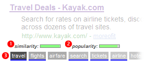
 an example search result
How moreofit Searches
Each website has a unique tag signature -- a set of words
that users have described the website as. Moreofit searches
for websites that have similar tag signatures and displays the results.
1: Similarity
A site's "similarity" is determined by how well its tag signature matches the tag
signature that is being searched for. A 100% match means that it has the exact same
tags in the exact same order, while a 0% match means it has no tags in common.
2: Popularity
The popularity of a website is, well, pretty much self explanatory.
3: Tag Signature
The tag signatures show how a site is described. The deeper the color of the tag,
the more frequently the website is tagged as this. Tags underlined blue denote a tag
that is in common with the search's tag signature.